Mentos 💊
OVERVIEW
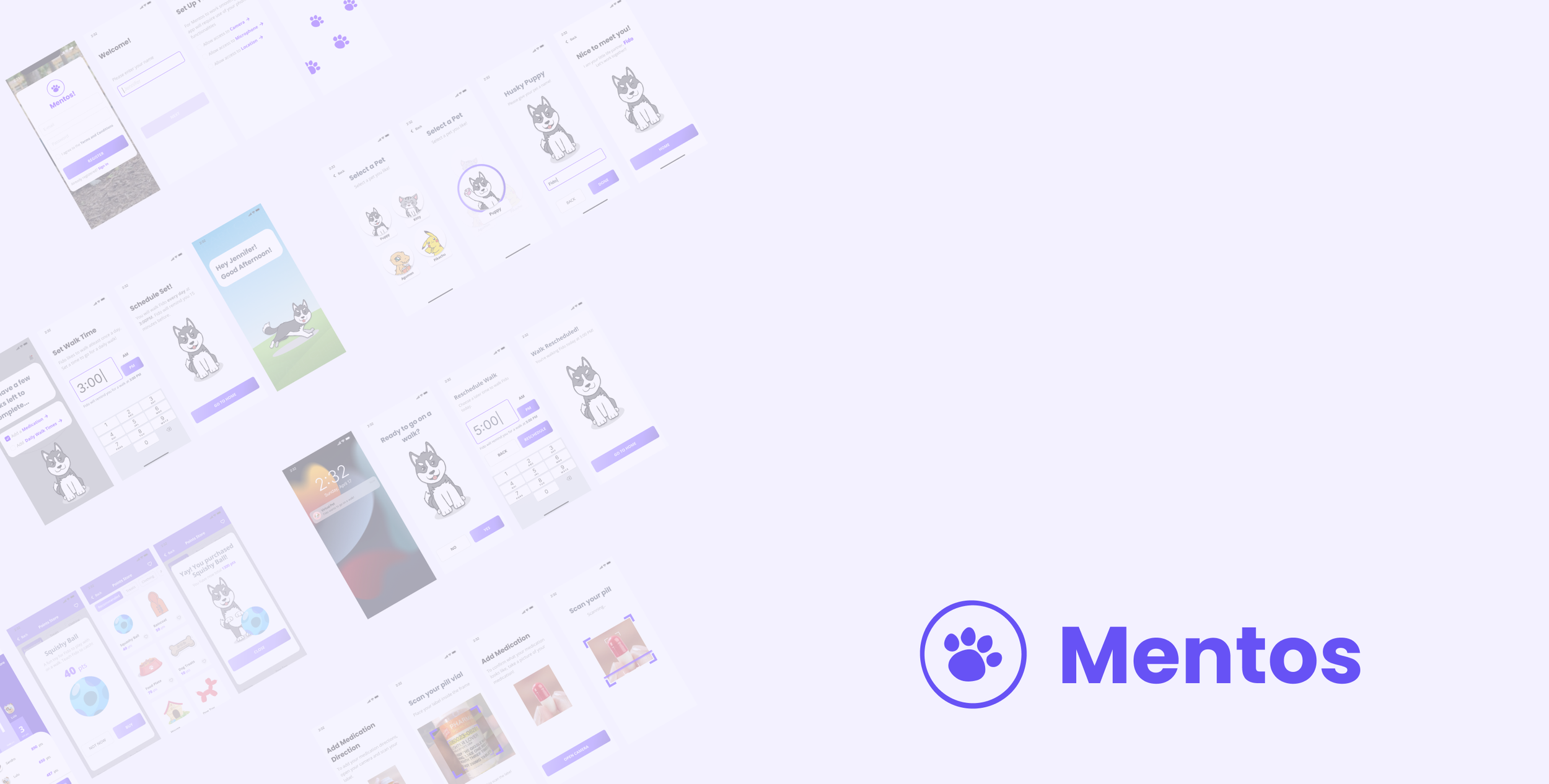
Mentos is a mobile application that provides users a friendly interactive application that encourages medication adherence by synchronizing with pet feeding times, suggests daily walks for emotional and physical support, and provides digestible information to empower patients with knowledge.
MY ROLE
I was a designer for this project, and I was in charge of:
Conducting user research interviews
Creating wireframes for the main features of application
Designing logo and setting visual guidelines
Building low to high fidelity prototypes
TEAM
Worked with two other Georgia Tech students and my role was:
User Experience Designer
InteractionDesigner
User Interface Designer
Visual Designer
DESIGN TOOLS
Figma, Miro, Photoshop, Illustrator
DURATION
4 months
PROBLEM
Incidence and prevalence of Type 2 Diabetes Mellitus (T2DM) continues to increase. For patients, achieving good glycemic control is the key factor in reducing worsening conditions, hospitalization and mortality. This control is achieved with implementing lifestyle changes and most importantly - adherence to anti-diabetic medication.
However, medication adherence for T2DM patients remains one of the lowest of all chronic conditions at 31% of medication adherence rate.
Medication adherence for patients with Type 2 Diabetes is prevalent in America, particularly for those in low socioeconomic class. Among the causes for nonadherence, there is much opportunity to address low health literacy and lack of social support.

SOLUTION
Medication Reminder
Remind users to take the medication on specific time
Connected with the pet’s feeding time for higher engagement/responsibility
Scan and check if the pill is correct medication for patients to take
Walk Reminder
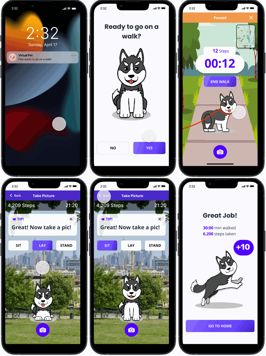
Remind users to go on a walk everyday
The application's haptic feedback will detect the user's movement
Provide a Photo Booth for users to have a close interaction with their pet
Take Quiz - Knowledge
Provide patients with better diabetes knowledge
Offer daily quizzes that users can take to learn about type 2 diabetes and other important health-related information

RESEARCH ⚙️
BACKGROUND RESEARCH
Recent studies based on large claim databases have identified key demographic factors, but it may be of greater importance to identify those critical factors that are potentially modifiable. The major determinants of non-adherence to treatment among patients with T2DM are broken down into 5 types:

USER JOURNEY RESEARCH
To best understand the patient’s context we explored the patient's journey from diagnosis at the physician's office to the patient’s home. We identified relationships our patient may have that impacts the patients’ medication adherence and attitudes and beliefs on their healthcare journey. Potential stakeholders in this journey are caregivers, nurses, physicians, social workers, healthcare specialists, pharmacists, nutritionists, payors, friends, support groups, and physical trainers.
Identifying the causes for medication adherence in our target population, we organized adherence causes and how they can be addressed at each touchpoint in the patients’ journey from the physicians office to their home.
RESEARCH INSIGHTS
In our research, we explored the medication adherence landscape and figured out most patients need knowledge and emotional support throughout their diabetes journey.
With help from the industry advisor and more targeted research, we narrowed down our scope further to tackle a smaller target group. We chose to focus on Americans 65 years and up who live alone as they struggle with motivation and support to proactively pursue better health outcomes.
Narrowing down our target group also helps identify and more specifically define our design objectives.

DESIGN ⚙️
IDEATION
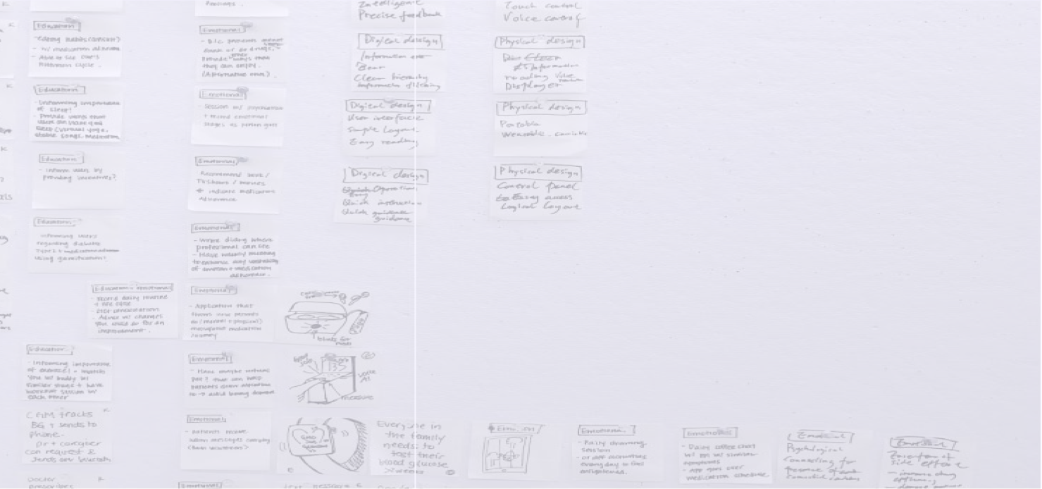
Our team kicked off our first brainstorming session to generate, share and organize ideas. After a few hours of brainstorming and documenting, we categorized our ideas by knowledge and emotional support to make sure they meet our design goals from our problem statement. Then, we categorized by the digital or physical solution to measure feasibility.
We narrowed it down to three ideas based on the number of votes each team member assigned by how they could meet our design goals. Three that meet most of the design goals that we push forward with further research and idea exploration are the Community Chat Application, Rx Management Dashboard, and Virtual Pet.
CONCEPT 1 - Diabetes Community Chat Application
A social platform specifically designed for diabetes patients that focuses on emotional support and having questions answered by medical professionals.
Strength ✅
Sharing knowledge
Community support and empathy
Chat - frequent updates
Most up-to-date information on the bottom
Informed answers by healthcare providers
Weakness ❌
May not necessarily lead to adherence
Sharing negative experiences
Information can get buried in the chat
Receive false information
CONCEPT 2 - Rx Management Dashboard
The RX Management Dashboard for Diabetic patients provides a daily overview of personal health status and reminds patients to take their medications.
Strength ✅
Visual display of medications
Monitors drug side effects/personalization
Scheduling for health management
Syncs with pharmacy software instantly
Weakness ❌
Can get tired / desensitized to the displayed information
Only for at-home use
Does not account for all side effects
CONCEPT 3 - Virtual Pet
Virtual Pet is an application that uses a friendly interactive virtual pet application that encourages medication adherence by synchronizing with pet feeding times, suggests daily walks for emotional and physical support, and provides digestible information to empower patients with knowledge.
Strength ✅
Learning opportunity
Encourages physical activity
UI components are small and inaccessible for elderly patients
Weakness ❌
May require too much attention
Sense of guilt associated with taking care of the virtual pet
FINAL CONCEPT
To decide the design direction of our final solution, we presented our solution to our peers, advisor, and professor. Virtual Pet seemed to have the most positive feedback because of its novel idea.
By the nature of a pet being a part of an owner’s everyday life, we felt our Virtual Pet idea could address medication adherence holistically. We saw many opportunities to provide features that would meet our outlined design objectives.
IDENTIFYING KEY FEATURES
We brainstormed our key features by referencing our initial design objectives. We listed the narrowed-down ideas using paper and pencil and created a storyboard to align ideas and present them for concept validation.
The key features we ultimately decided on were:
1. Physical Exercise
2. Medication Reminders
3. Mood Tracking

EVALUATE ⚙️
USABILITY TESTING
Our primary testing goals were to make sure the app user flow worked as intended and confirm that it was easy to use.
Methods
We recruited 5 testers from target population demographics. 4/5 testers had type 2 diabetes, and 1/5 of testers were not diabetic but took chronic medications.
We tested 5 key flows.
Logging in → Medication setup → Taking medication → Checking mood → Going for a walk
We used 5 points Likert scale to gather quantitative data on users’ ease of use for each user flow. We also gathered qualitative data by asking open-ended questions to learn what part was memorable, noticeable, and delightful.
Participants Analysis
By collecting our notes from our open-ended discussions with our testers, we were able to gather commonalities.
CHANGES AFTER TESTING
After conducting usability testing with all five potential users, we asked them to elaborate more on the challenges, and we were able to identify room for improvement.
Proper Visual Feedback After Selecting a Pet
Providing AM/PM Options to Meet Existing Expectations of UI
Increasing Visibility for Points Store
BRANDING
Logo
We chose circular shapes as they draw viewers' eyes to the logo. We chose pawprints to be inscribed in the circle as it best communicates with the pet, which is our core product.
Colors
Studies show that the elderly prefer colors like red, green, blue, and purple. We chose purple since purple is warmer than blue, which is a commonly used color in healthcare branding that gives a more sterile, and professional feel.
Shapes
To continue with the friendly and discoverable shapes we chose large shapes with rounded edges that are friendly, inviting, and easy to click.

FINAL DESIGN


